City of Rochester
Role
UI/UX Designer
Services
Figma
Highlighted Skills
User Research & User Flow
Timeframe
12 weeks
Transformed the City of Rochester's digital presence by redesigning and prototyping a multi-page website to streamline navigation and improve user flow. Leveraged A/B testing and iterative design cycles to deliver a consistent, user-centered solution that enhances accessibility and usability.
01
Context
The City of Rochester has a website filled with a lot of potential for revamping. Upon load, the site has a cluttered interface, making it difficult for users to navigate and find the information they need. Those using the site were facing issues with the inconsistent treatment of buttons, lack of hierarchy, and puzzling contrast- which extremely hindered the website's potential to have thorough and helpful accessibility features.
02
Persona
Rochester is home to a lovely and diverse community. I created a persona that would most likely reside with a few of the families currently residing in the city long-term.
Name: Clara Cumberbatch, age 42
Occupation: Full-time soccer mom and cat parent
Interests: Wine tastings, finding community events for her kids
Story: Just moved to Rochester (Chili, to be specific). After completing her PHD, she wants to settle down and focus on her family. She is mainly interested in getting acquainted with Rochester (finding information about parking, trash pickup, snow removal, towing, etc.), their school districts, as well as community event involvement.
Other occupations I explored before crafting this persona included: Food truck vendors, realtors, post-RIT graduates who decided to stay in the city (looking for information about apartments, city safety, jobs, and snow tires), and a Public Policy graduate wanting to work for the city.
03
User Interview
To further understand Rochester, I conducted a user interview with Jessica Lieberman, PHD. As she is not only the Chair of Humanities, Computing, and Design at RIT, she is also the Community Liaison & Visual Arts Expert for the City of Rochester's ‘Aqueduct Reimagined’ project. That being said, she knows the website quite well.
In summary, she raised these following issues with the site: the carousel photos not linking to pages, overall color palette, lack of CSS elements, many 3D buttons vs. a 2D page, broken site search engine, outsourced photo gallery, and a multitude of tiny inconsistencies. But she was quite happy with the site's responsive resizing for mobile devices.
04
Competitive Analysis
Drawing inspiration from three beautifully designed city pages– Allen and Dallas TX, as well as Perth, Australia– I collected a list of patterns found that allow those pages to be an overall positive viewing experience for their users.
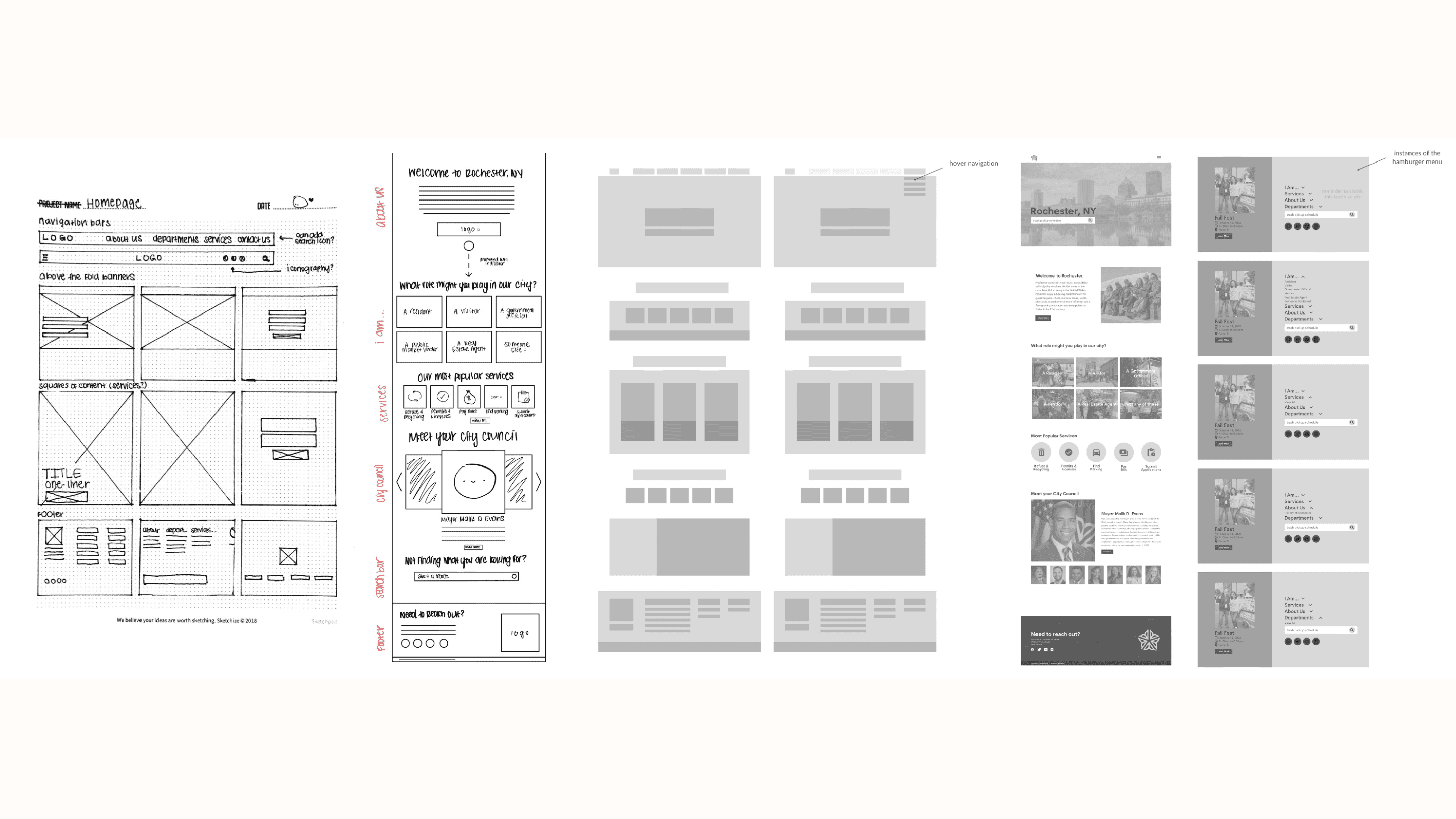
The list is as follows: above the fold banners, navigation bars with dropdown menus, fade transitions on pages, features on social media and events, visitor guides, footers with basic navigation, weather indicators, iconography, interactive buttons (more than just :hover), chat bots with personality branding, carousel with photo previews, and features on news articles.
05
Result
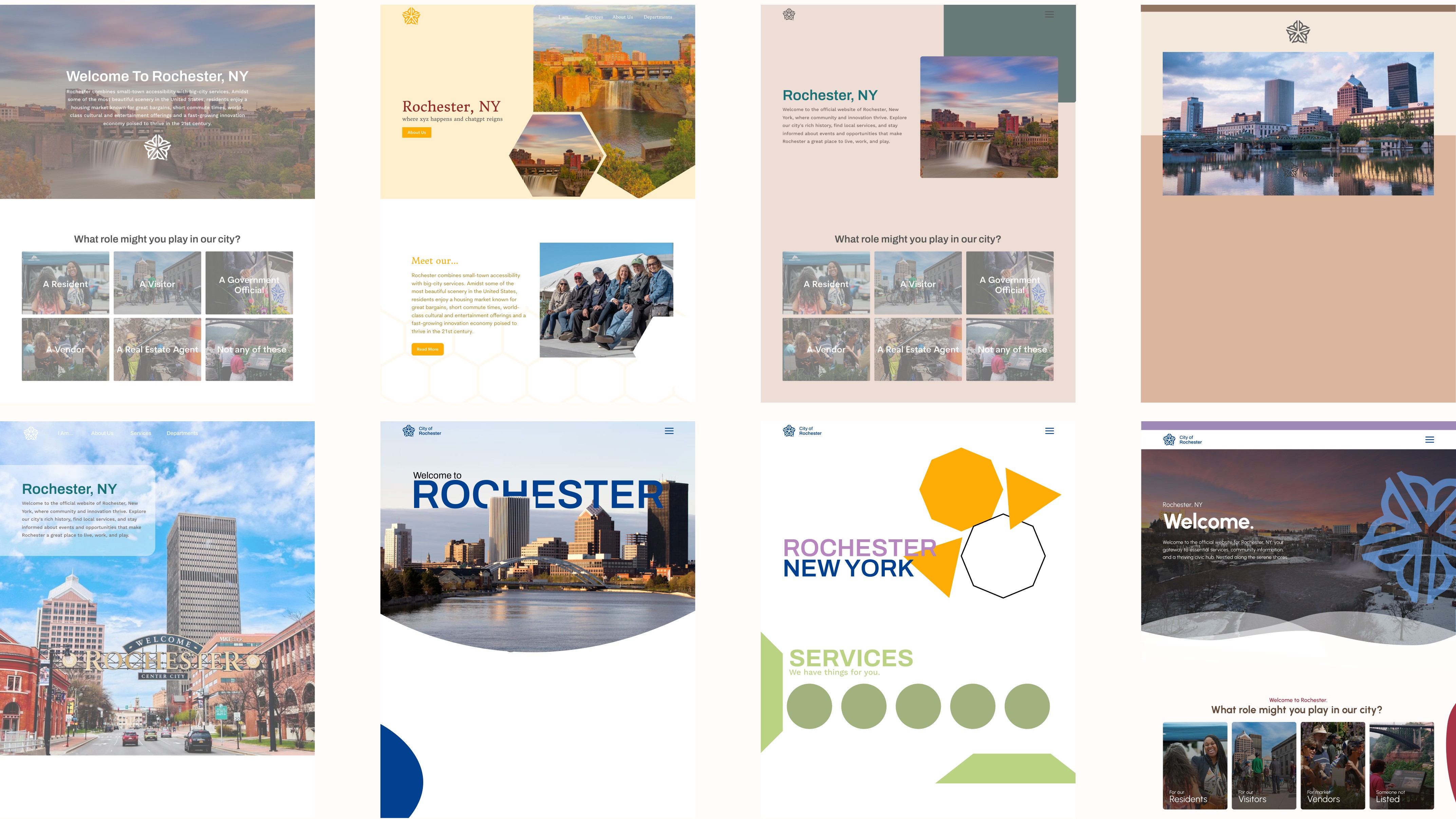
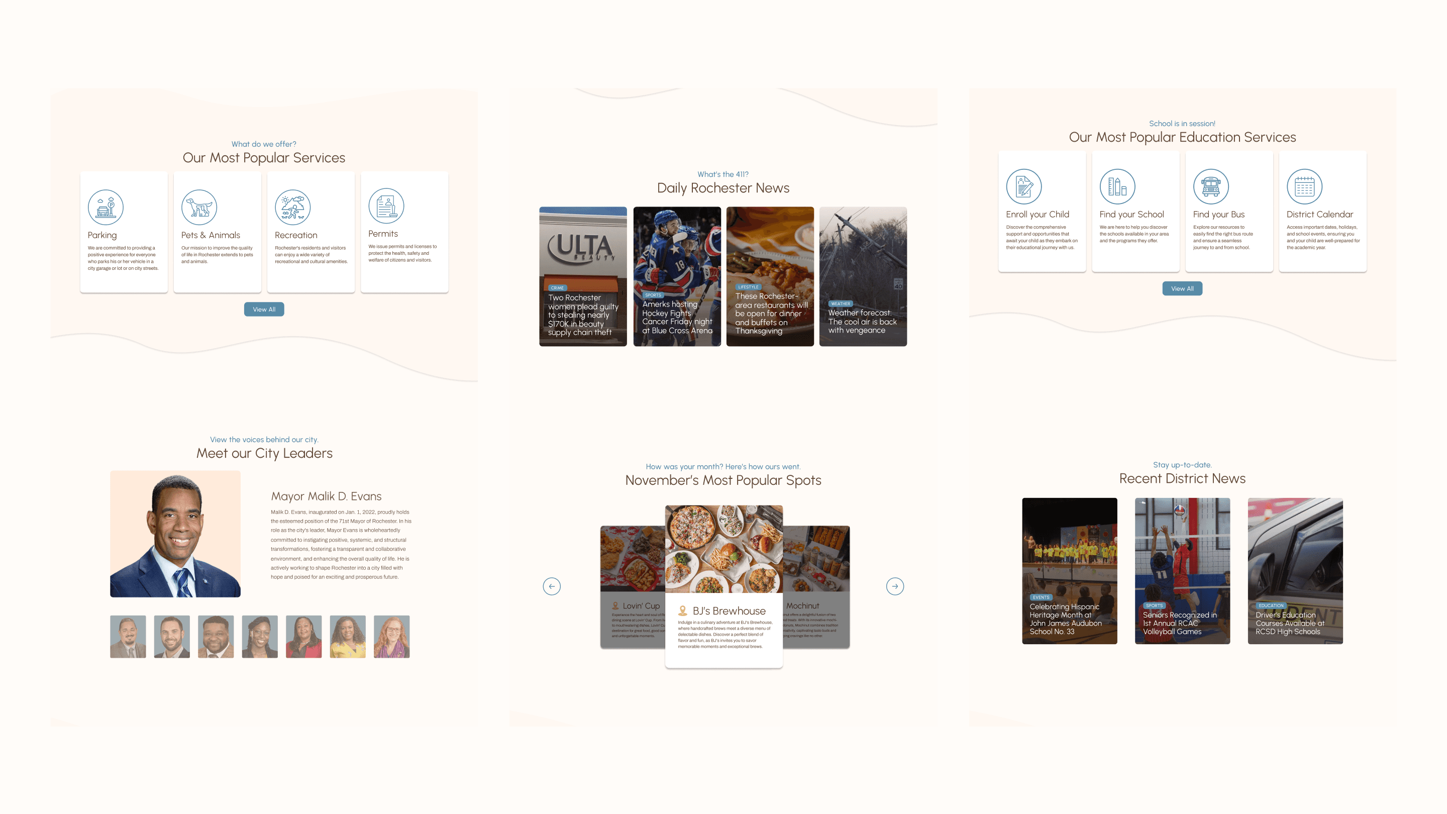
The redesigned website focuses on implementing a clean, clutter-free interface, making it easier for users to navigate and access the information they need. The addition of a cohesive color palette, a sticky navigation bar, easy to recognize iconography, and simple page hierarchy, ideally enhances user engagement and allows for an increase in use retention. Many more changes can be added in further iterations to come in order to allow Rochester residents to have a website that properly reflects the beauty of their city.
Though, I will say, those 11 weeks were definitely not easy. I designed and prototyped many things I thought I was happy with, but ended up going back to the drawing board multiple times. I learned to be comfortable with this process, and to get used to iterating with the goal of improving, instead of just creating something to fulfill a deadline. I also further sharpened the skill of being able to think in the mind of a user, and to design something tangible for them and their needs, as opposed to me just designing for what I think looks the best and works the best.
While this project taught me invaluable information about the importance of navigation, a coordinated color palette, website accessibility, and section layout, it also taught me how difficult it is to design all of these things for a website at all. Huge kudos to the City of Rochester for doing what they could with their current website, and shoutout to them for letting me take a strike at redesigning something that must have been hard to design upon first implementation.
